Brand Identity, Packaging Design
Jamberry is a brand concept for an organic jam manufacturer and distributor. The brand uses 100% BC sourced ingredients in its products — no added sugars or preservatives, just amazing local fruit.
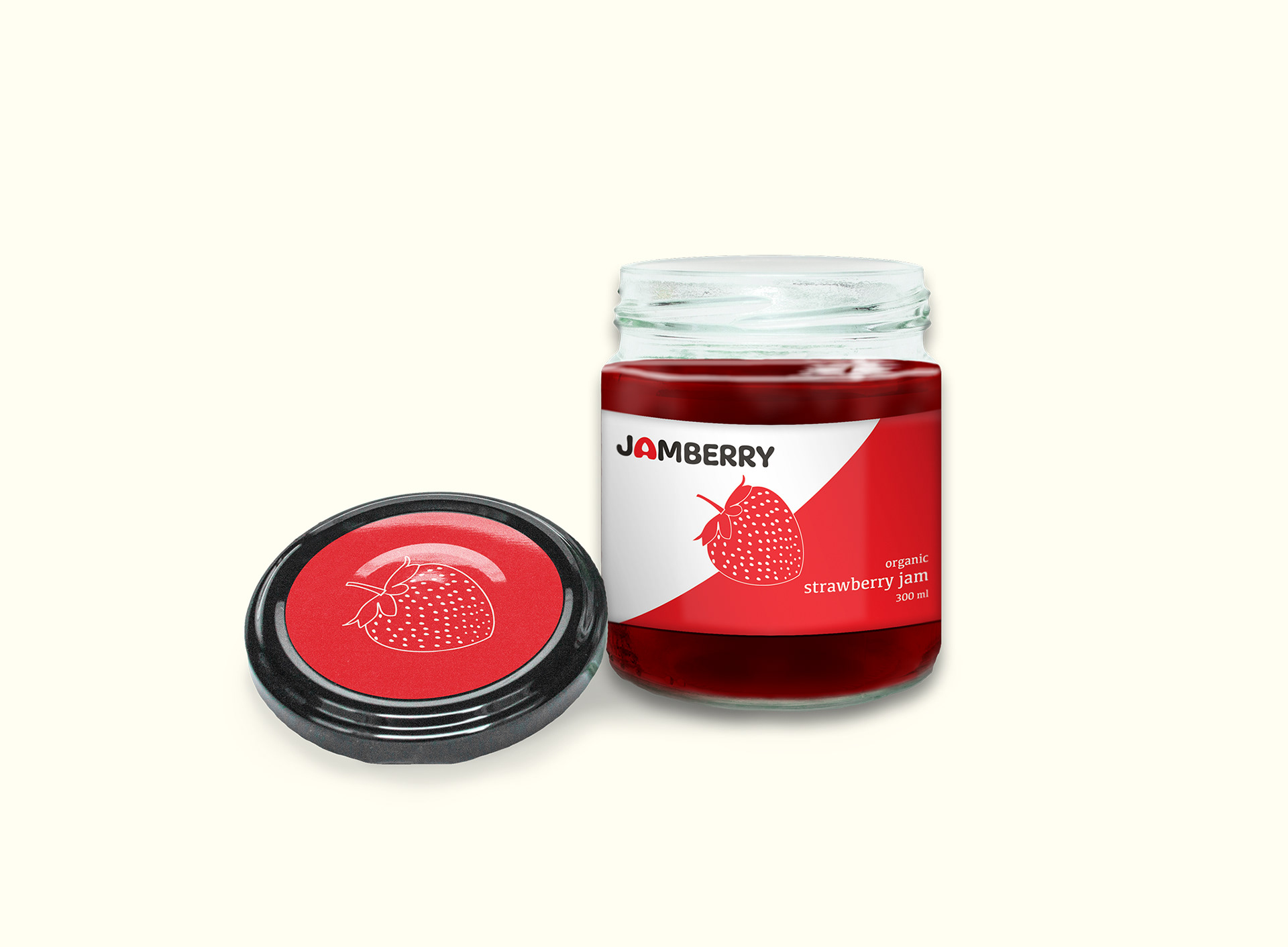
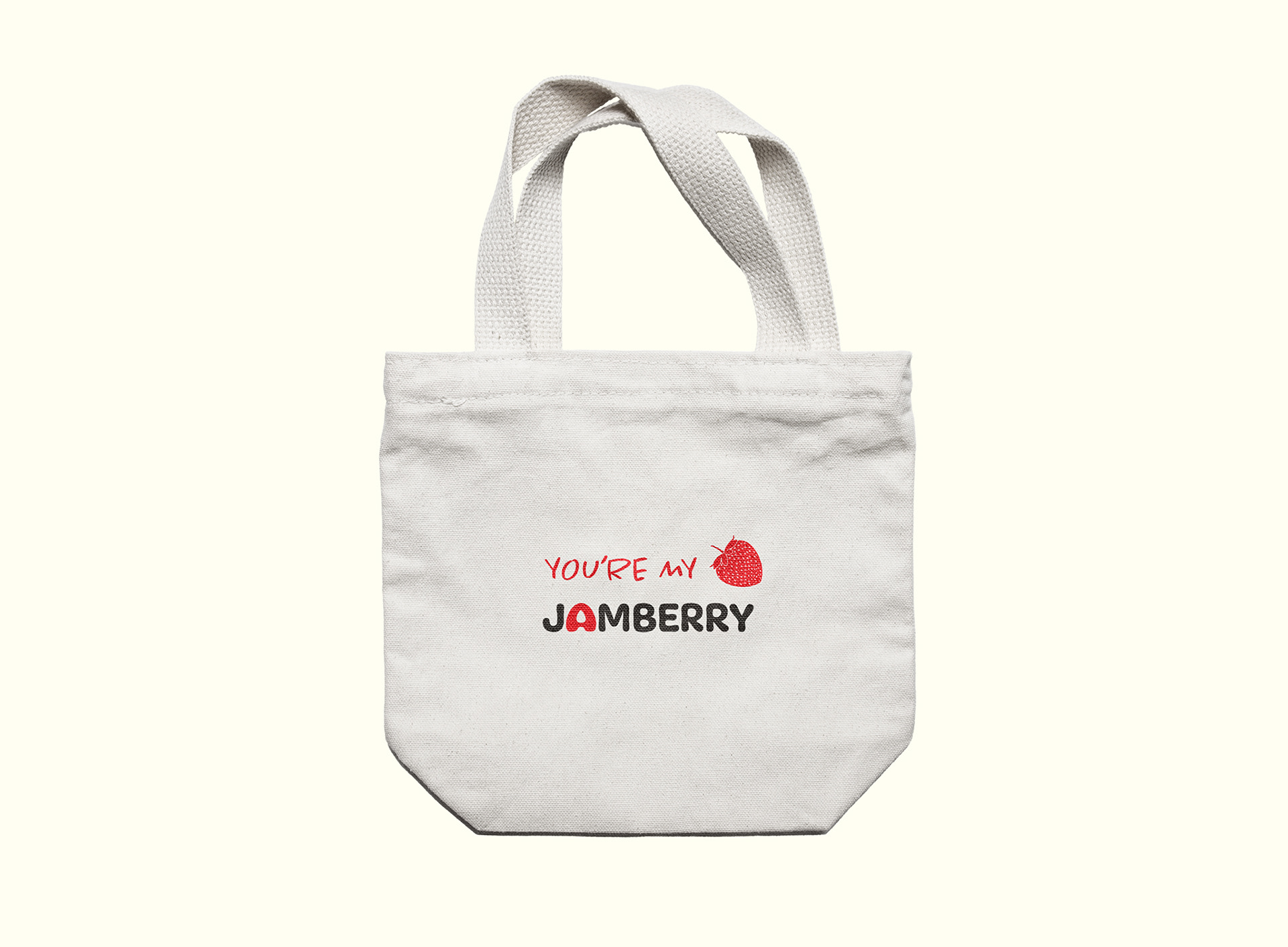
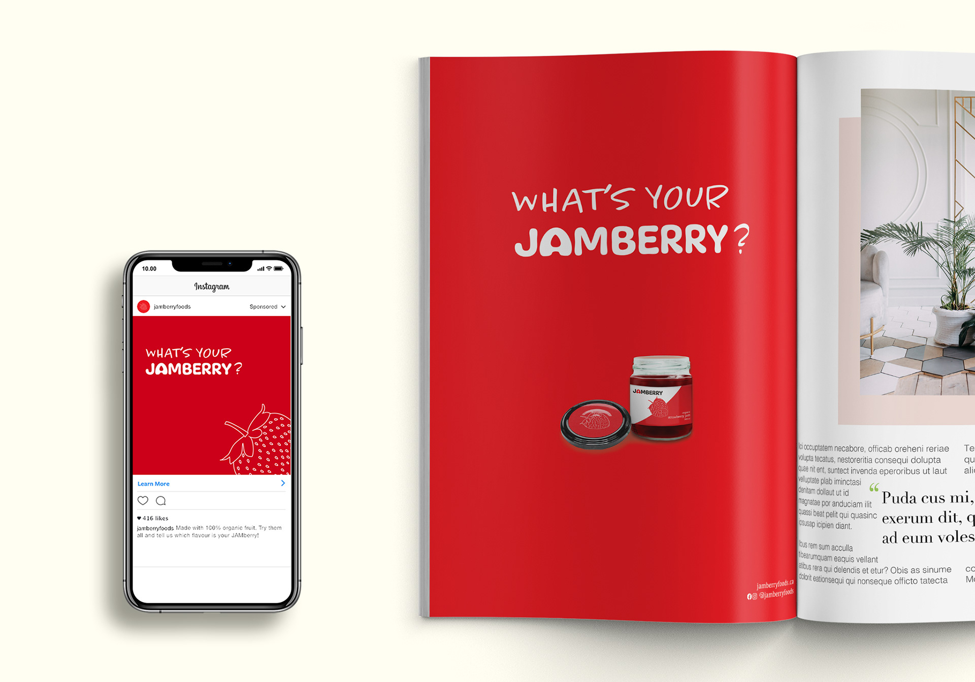
The scope of this project included developing a brand identity (logo, tagline, colour palette, stationary and style guide), two forms of packaging design, a promotional accessory and ad layouts (print and digital).
With the high degree of competition in the food industry — it was important to create a brand image and packaging that would stand out on store shelves.
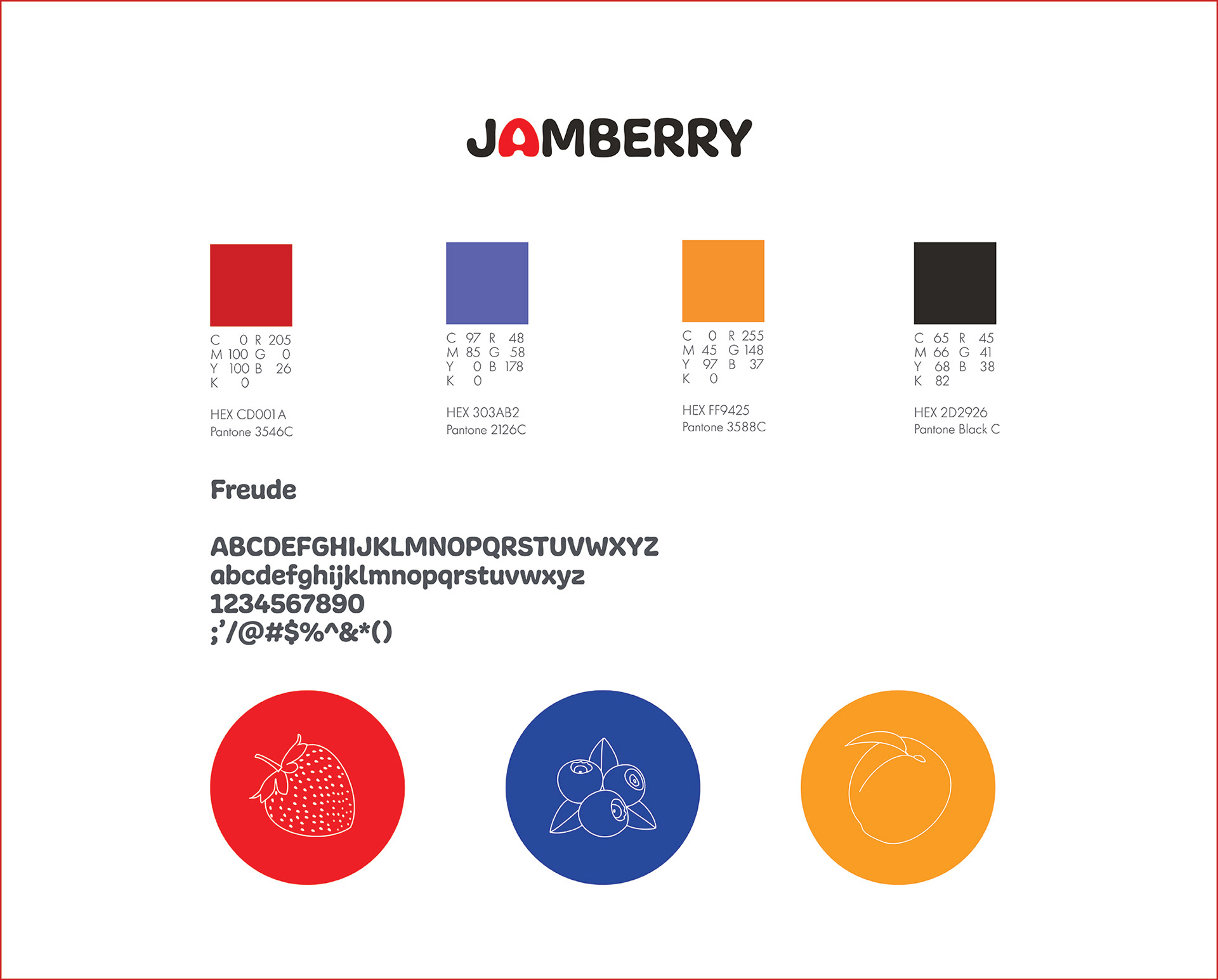
Jamberry’s brand is fun and lively and this is reflected in the bold, punchy colours chosen for the colour palette. The logo’s font, Freude — with its soft round edges and thick lines — is a playful, bold font that evokes a friendly, fun image and pairs nicely with the brand’s colours. The “A” in Jamberry was modified to look like a stylized, upside-down berry, playing into the brand’s name and its signature flavour, strawberry.
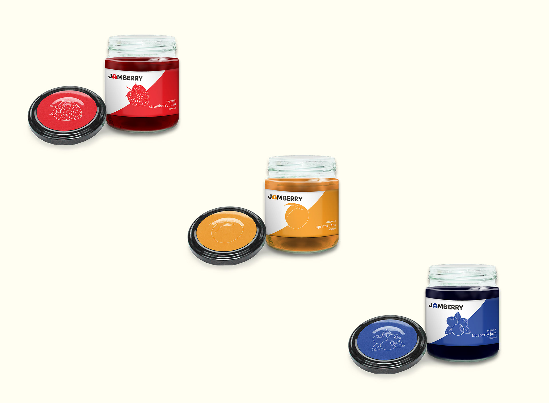
It was crucial that the brand identity had the ability to translate throughout all packaging and branding materials and accommodate each of its flavours.
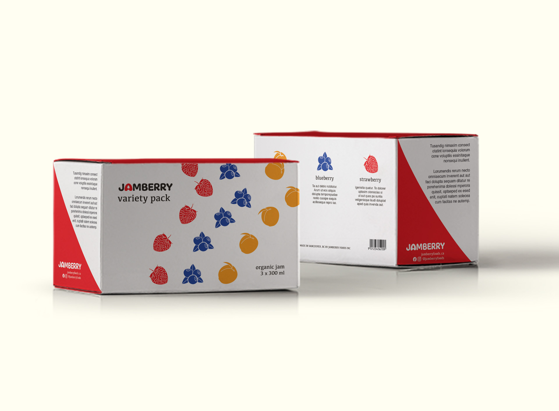
The packaging and label colours were chosen for their vibrancy and high visibility on supermarket shelves, in addition to representing the jam’s flavours: berry red (strawberry), purply-blue (blueberry) and orange-yellow (apricot).
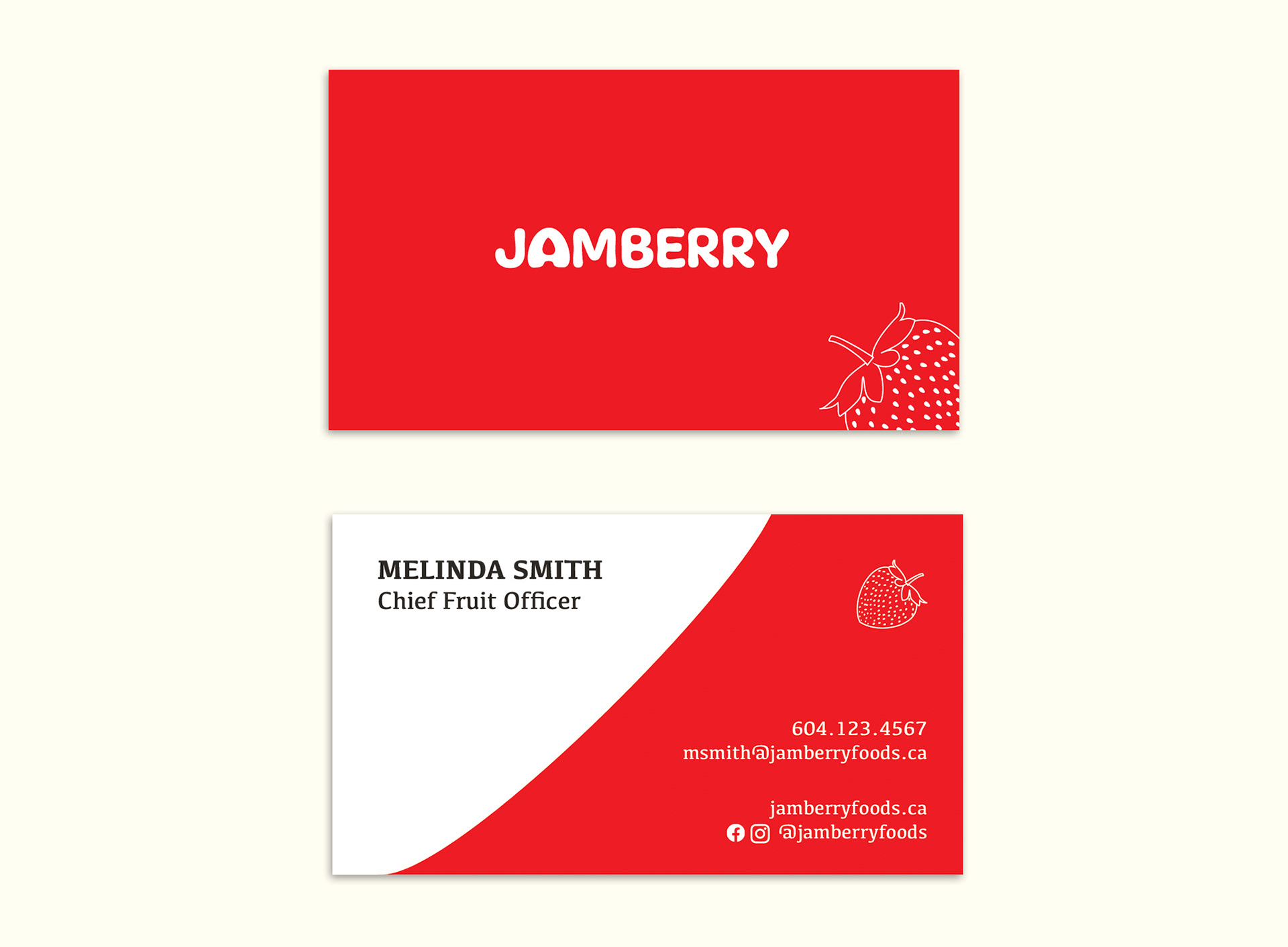
Jamberry's stationary and promotional pieces embody the brand's fun, playful image.
The taglines, "What's your Jamberry?" and "You're my Jamberry" are meant to be fun plays on the popular saying, "That's my jam."
Created using Adobe InDesign, Illustrator and Photoshop